Keeping your family’s health within easy reach
Helsi is a nationwide platform (9M+ users) for managing healthcare online. As a dedicated product designer, I focused on uncovering core user pains and shaping strategic solutions that support smoother, more human-centered care experiences.
- Role
Dedicated Product Designer
- Work
Product Design
- Platform
IOS / Android / Web
- Country
Ukraine
- Year
2023 - Current
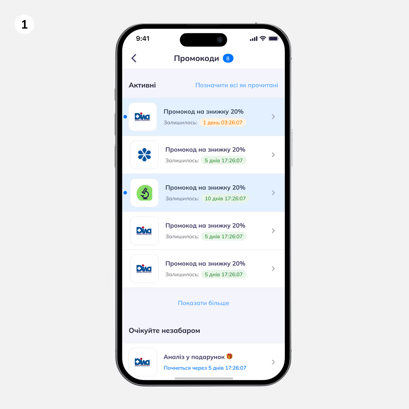
BEFORE
This was our promocode page. Users weren’t engaging with it at all—the layout felt flat, and with only 10 partners at the time, the page looked empty.
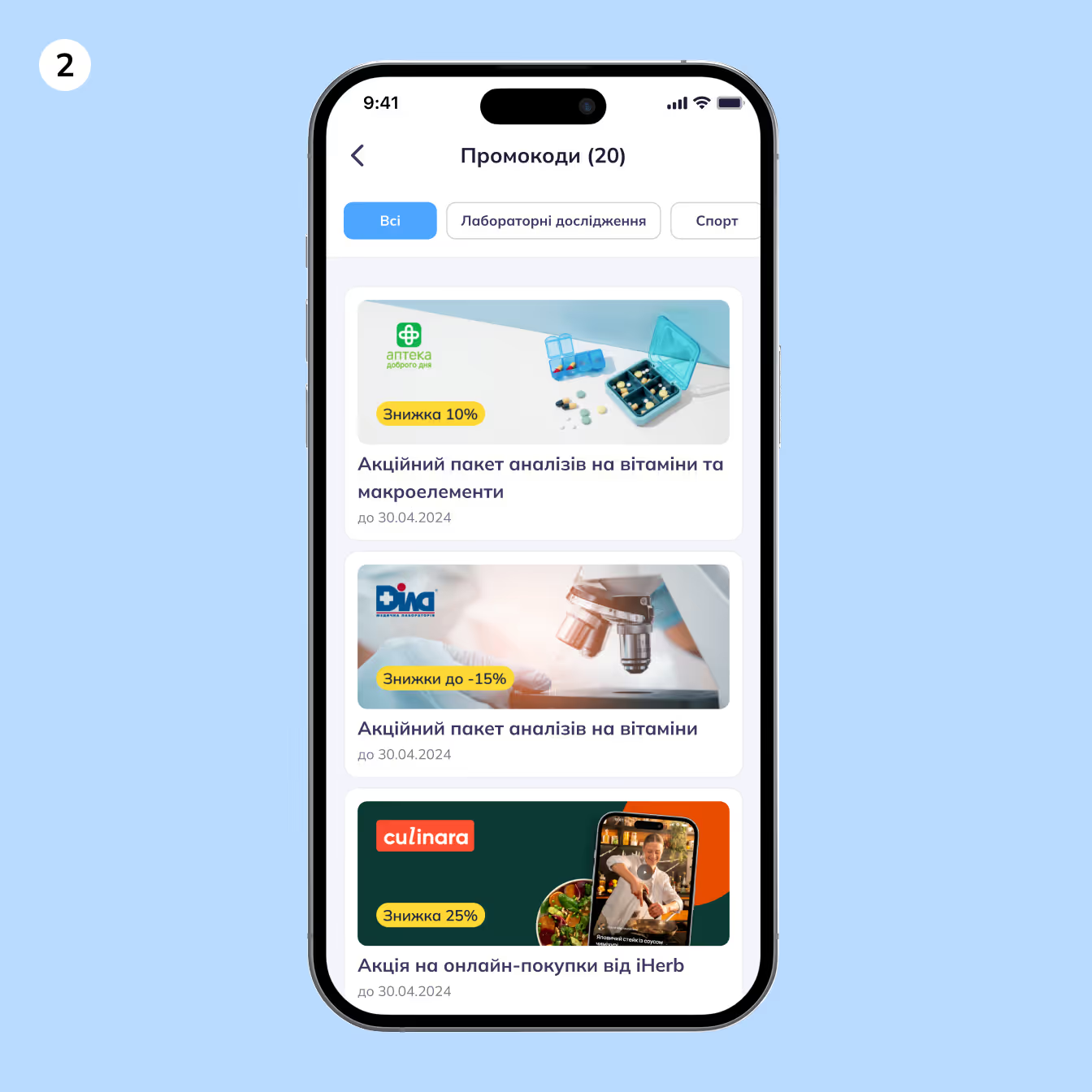
AFTER
To draw users in, I introduced visual cards featuring partner logos and discount amounts. I also enlarged the promocode element itself, which filled the screen and created the impression of having more offers. We added categories as well. Even though they seemed unnecessary with just 10 partners, I anticipated growth—and it worked. After these updates, the number of partners willing to pay to place their offers grew 5X (up to 50).

BEFORE
Over time, however, the page became difficult to navigate because of the sheer volume of offers. Even categories weren’t enough. In user research, I confirmed that people primarily scanned for logos when searching. But the logos and discounts didn’t always have enough contrast against the backgrounds, and promocode texts were long and not particularly helpful. It became clear we needed a new approach.
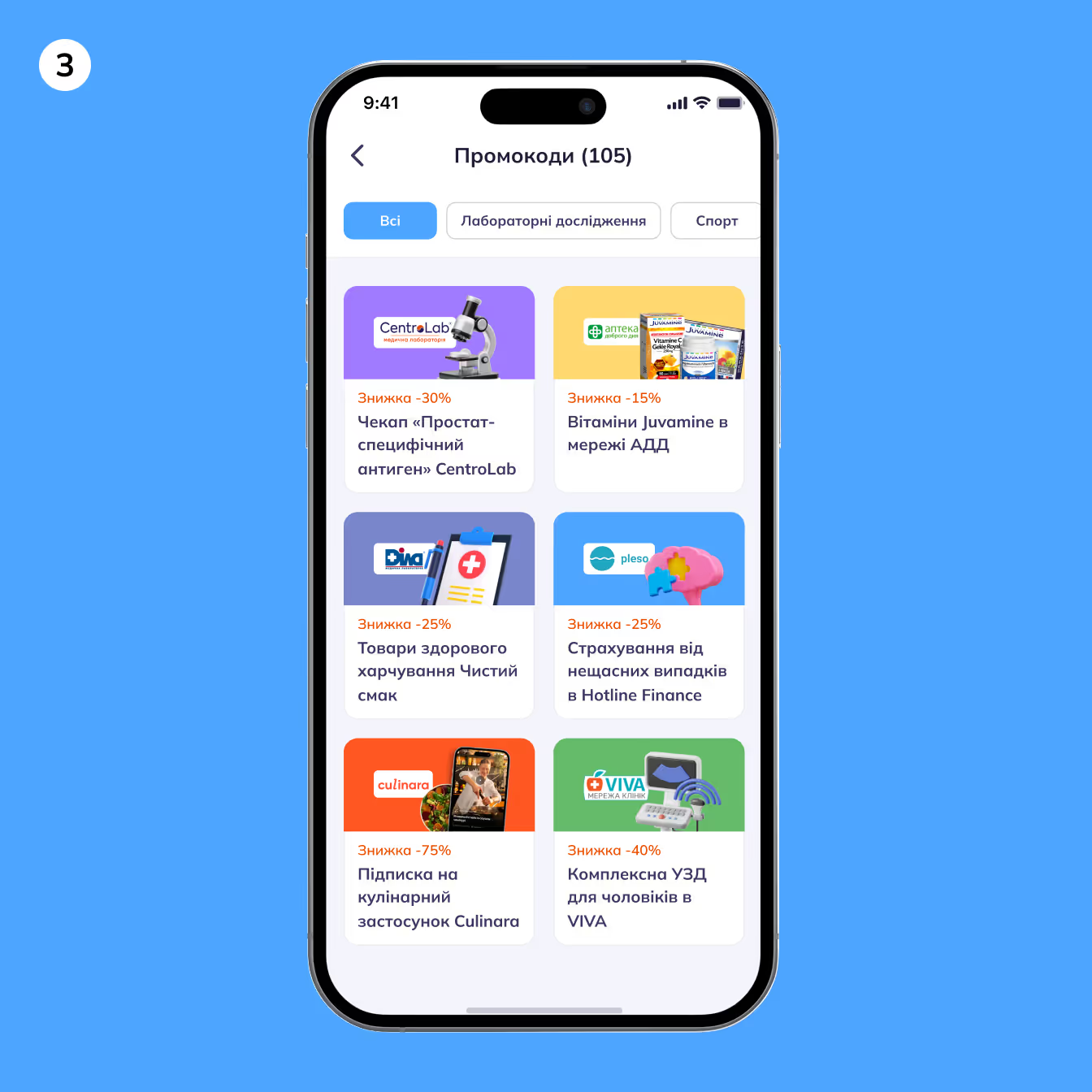
AFTER
We redesigned the page to make it cleaner and more intuitive. Logos were placed at the center of a white background, helping users scan offers quickly and effortlessly. I also pushed for a simpler, clearer naming system for the promocodes. This overhaul made a significant impact: the number of partners increased 10X from the previous stage, bringing us to 100+ partners currently placing their offers in the app.
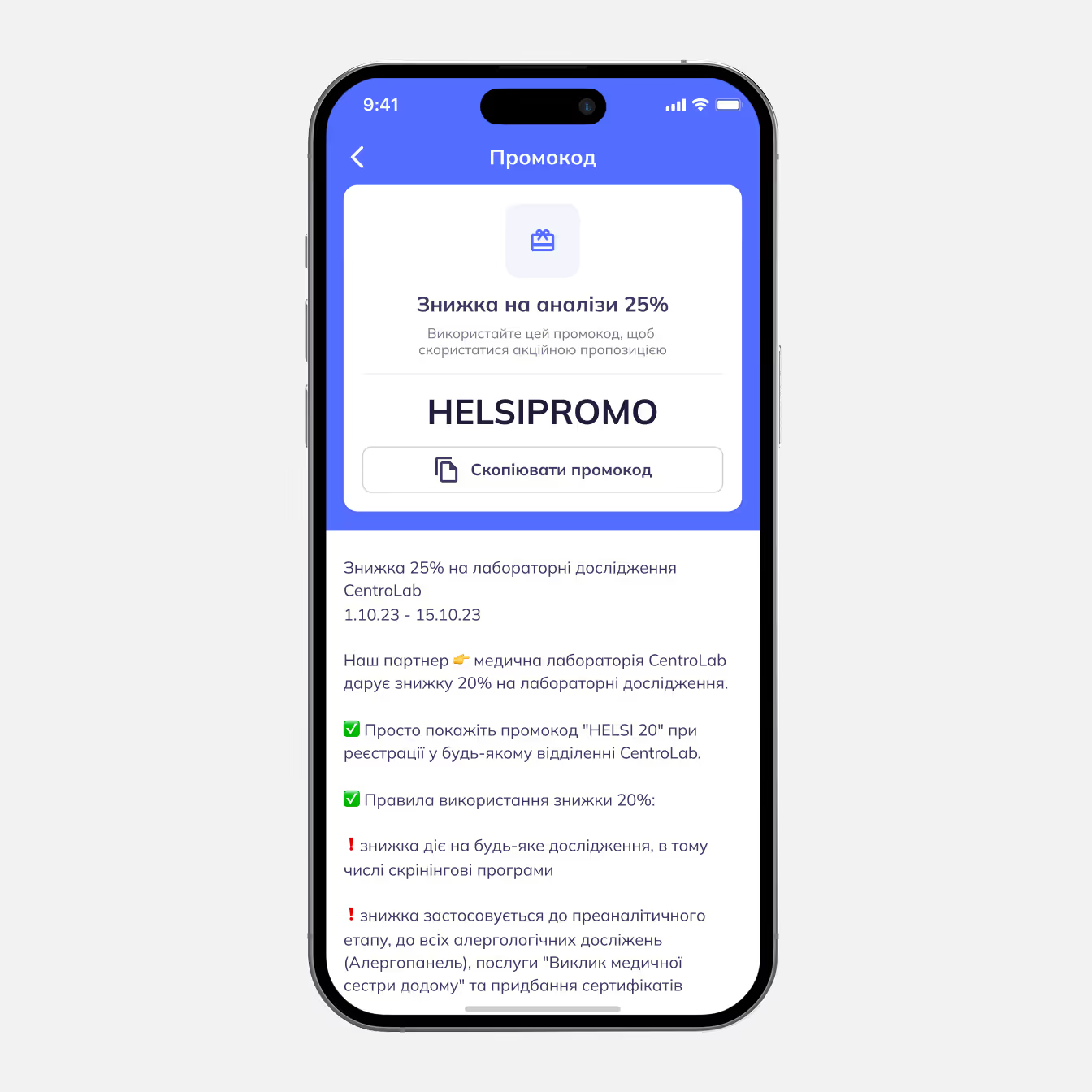
BEFORE
The offer felt generic and unbranded, the promocode blended into the content, and users had to dig through long paragraphs just to understand what to do. Essentially, nothing guided the user’s eye, so the whole experience felt overwhelming and unengaging.
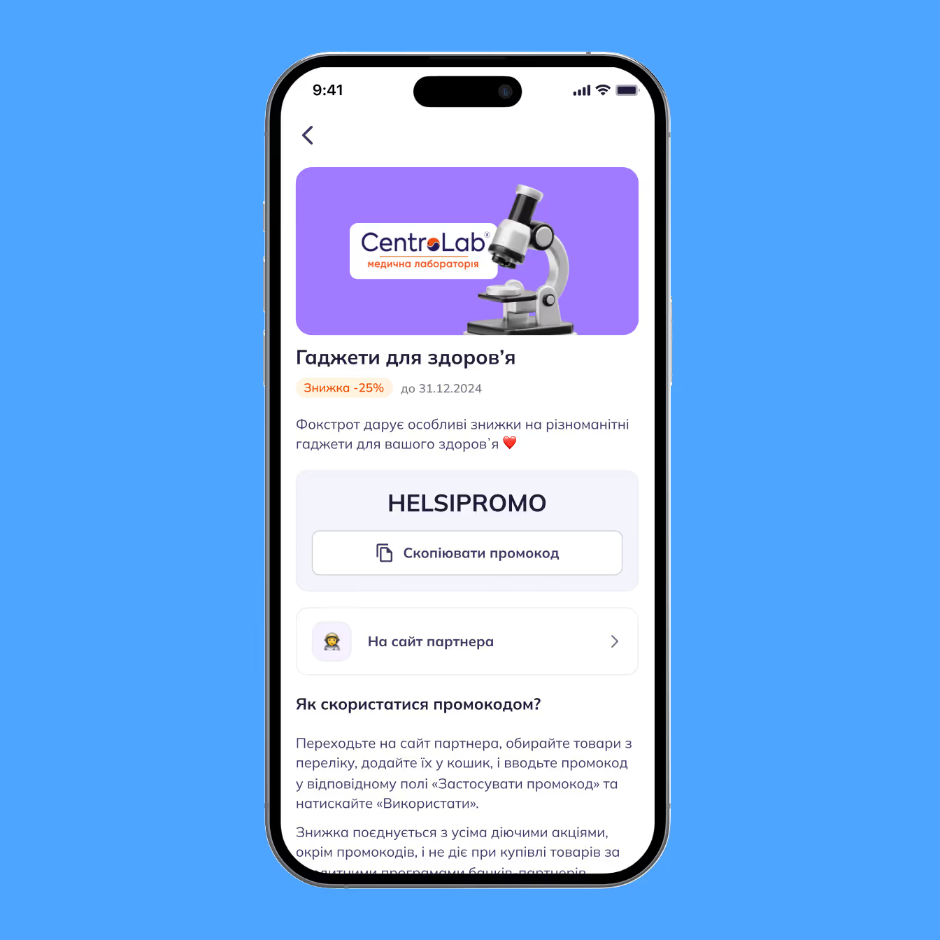
AFTER
We added a partner banner at the top, created a proper information hierarchy, and gave the layout enough breathing room so users can instantly understand the offer. The promocode block is centered and highlighted, instructions are structured, and the “Go to partner” button is finally noticeable instead of getting lost.
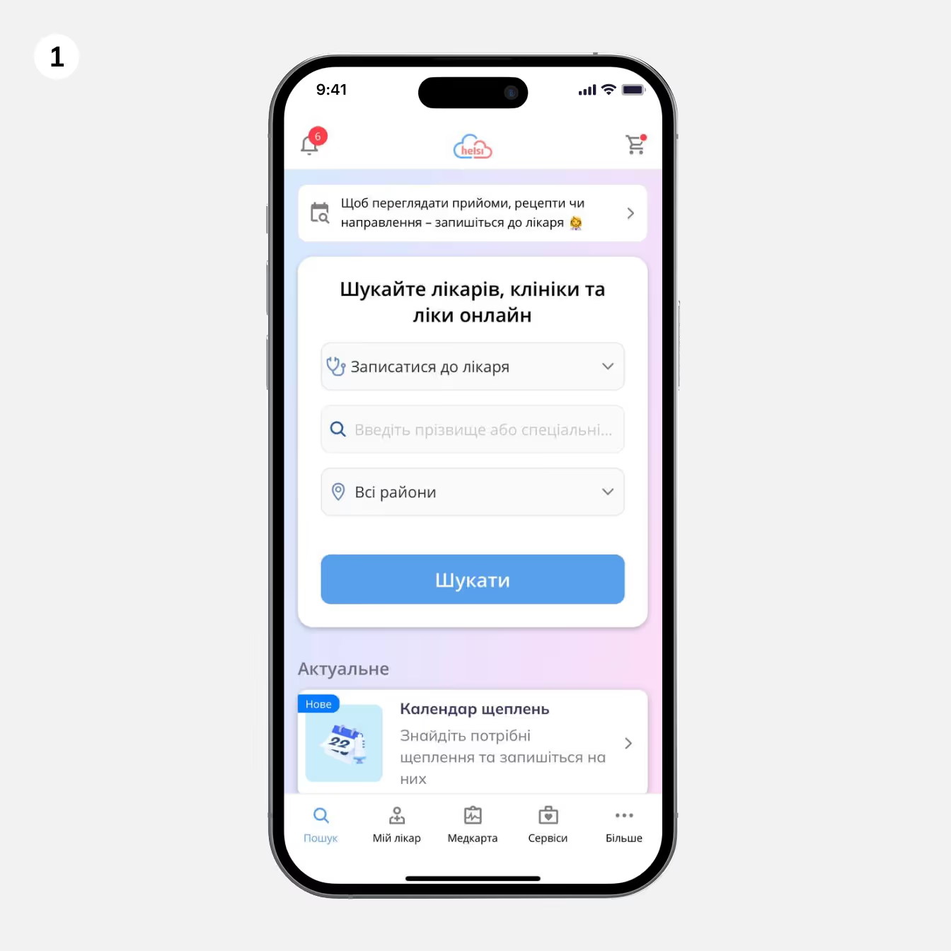
BEFORE
The search block took up most of the screen, pushing all useful content down, while the gradient background created unnecessary noise. Users didn’t immediately understand what they could do in the app besides searching, and important entry points were getting lost.

AFTER
We reorganized the entire structure to make the screen more purposeful and easier to navigate. I removed the gradient background, introduced a clean white header, and structured the content into clear, predictable sections. We also needed to incorporate the ads in this size specifically, which was a big barrier for me to create the best design. But we definitely needed those, as the partners pay us for the display.
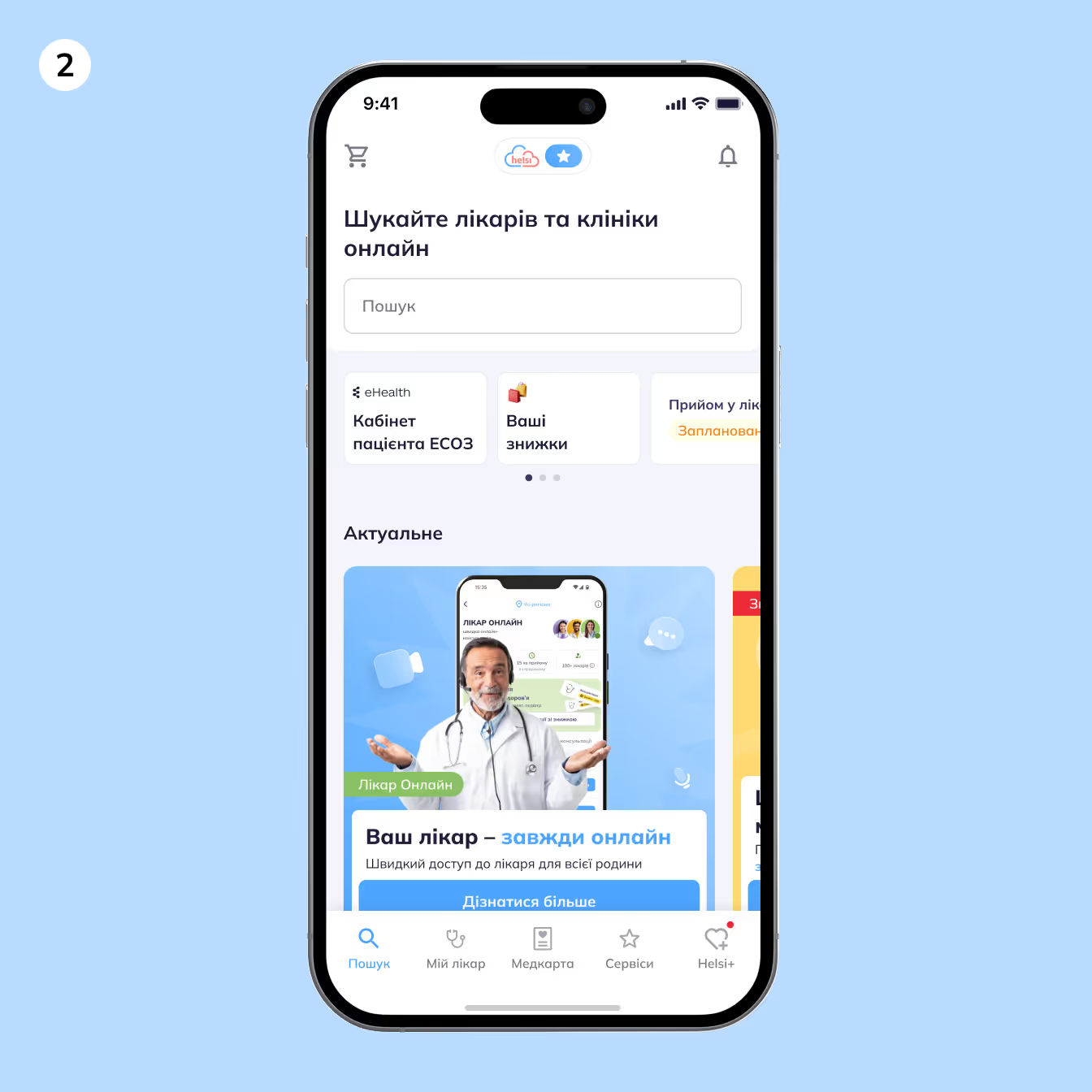
BEFORE
Although the second version was much cleaner, it still relied too heavily on horizontal carousels and didn’t offer clear navigation anchors. Users had to swipe through multiple sections just to understand what the app offered, and many key actions were still hidden below the fold. During interviews, we also learned that users didn’t really understand or care about the blocks placed under the search bar — most of them simply ignored those cards altogether. The ads were oversized and visually dominant, distracting from more important tasks. On top of that, this version still had five menu tabs, which led to confusion and low usage across several sections.

AFTER
I optimized the search space and the ad size. Also, I combined Main page with Services to increase feature adoption and declutter the space.
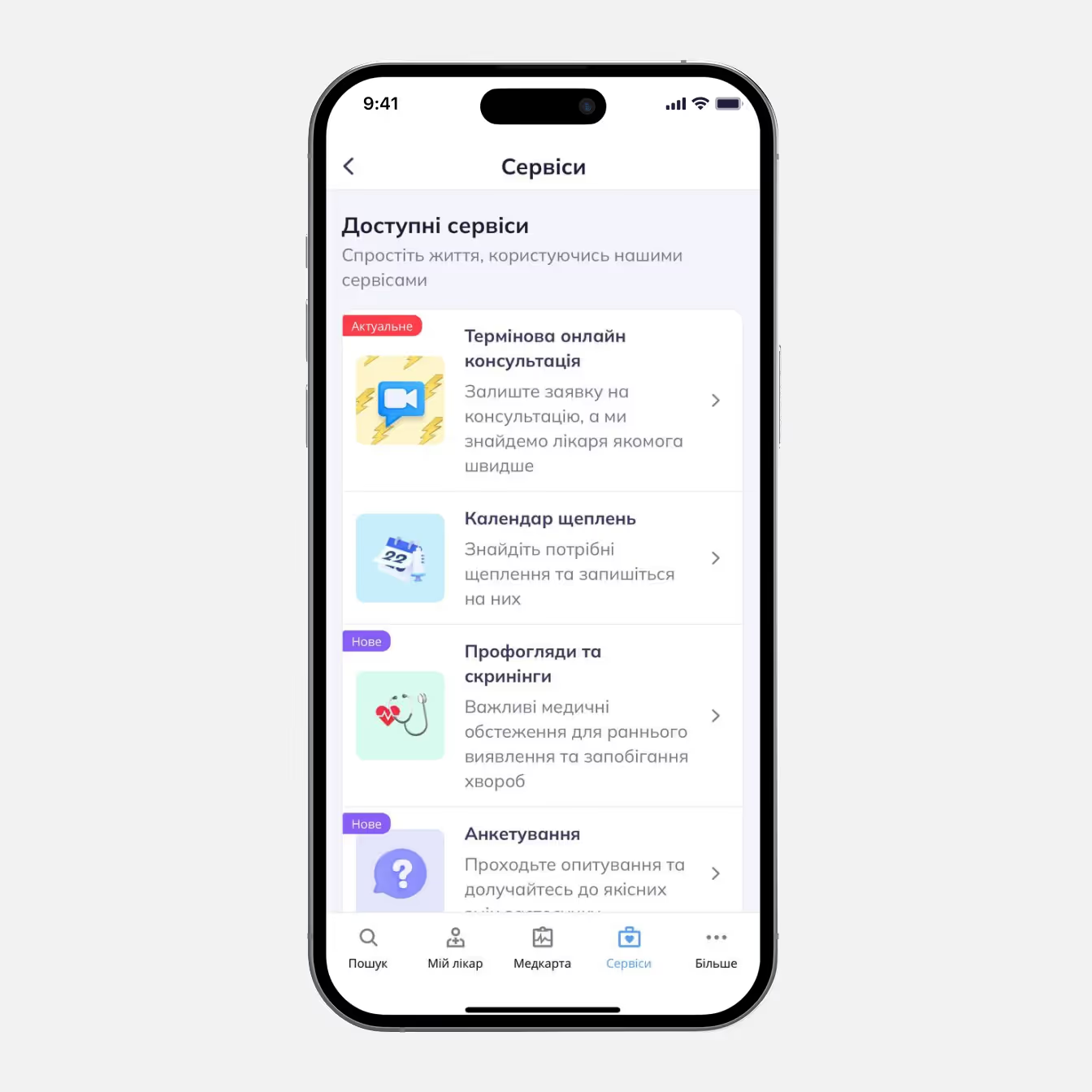
BEFORE
The old Services screen was functional but very flat and uninspiring. It presented a long vertical list with small icons and minimal visual hierarchy. Also, users need to scroll a lot to find what they need as the services didn’t fit in one or even two scrolls.
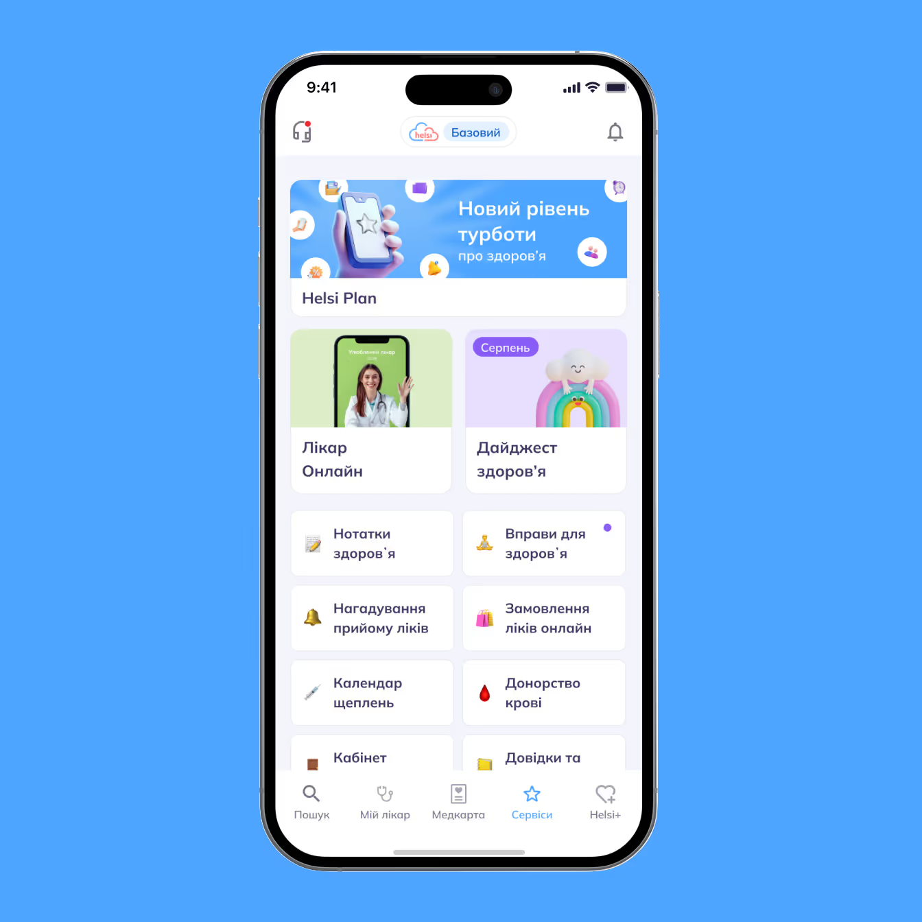
AFTER
We reorganized all services into clear, structured cards with consistent illustrations and emphasized the most important actions. This helped users understand the page at a glance without scrolling. As a result, page visits grew by 26%, and clicks increased by an average of 34%.

BEFORE
We didn’t have an onboarding at all, and a lot of our features were invisible for new users.
AFTER
I designed this onboarding to showcase our primary and secondary services, aiming to boost feature adoption.
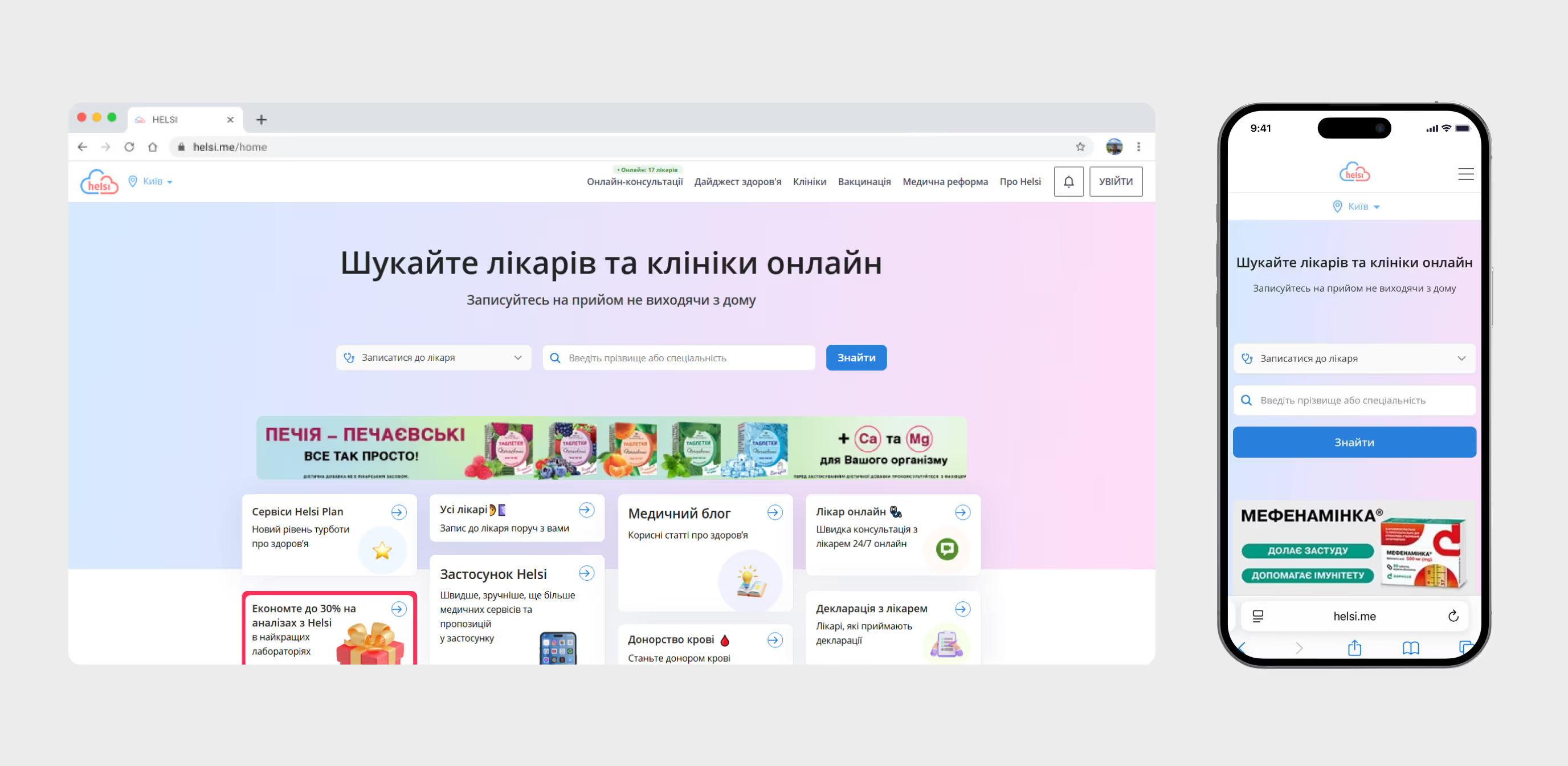
BEFORE
We discovered that users largely overlook the search, even though it was intended to be the main action on the screen. In fact, one of the tiles below the search— which also redirected to search—received 5X more clicks. The page had three ways to book an online appointment, which is clearly unnecessary. The header navigation felt cluttered, and users paid little attention to it. Additionally, eight entry-point tiles were overwhelming, resulting in very few clicks. And yes—we still need to keep the large, colorful banner on the first screen.
On the mobile version, users could only see the search and the ad—none of the other services—causing a significant drop in feature adoption.
AFTER
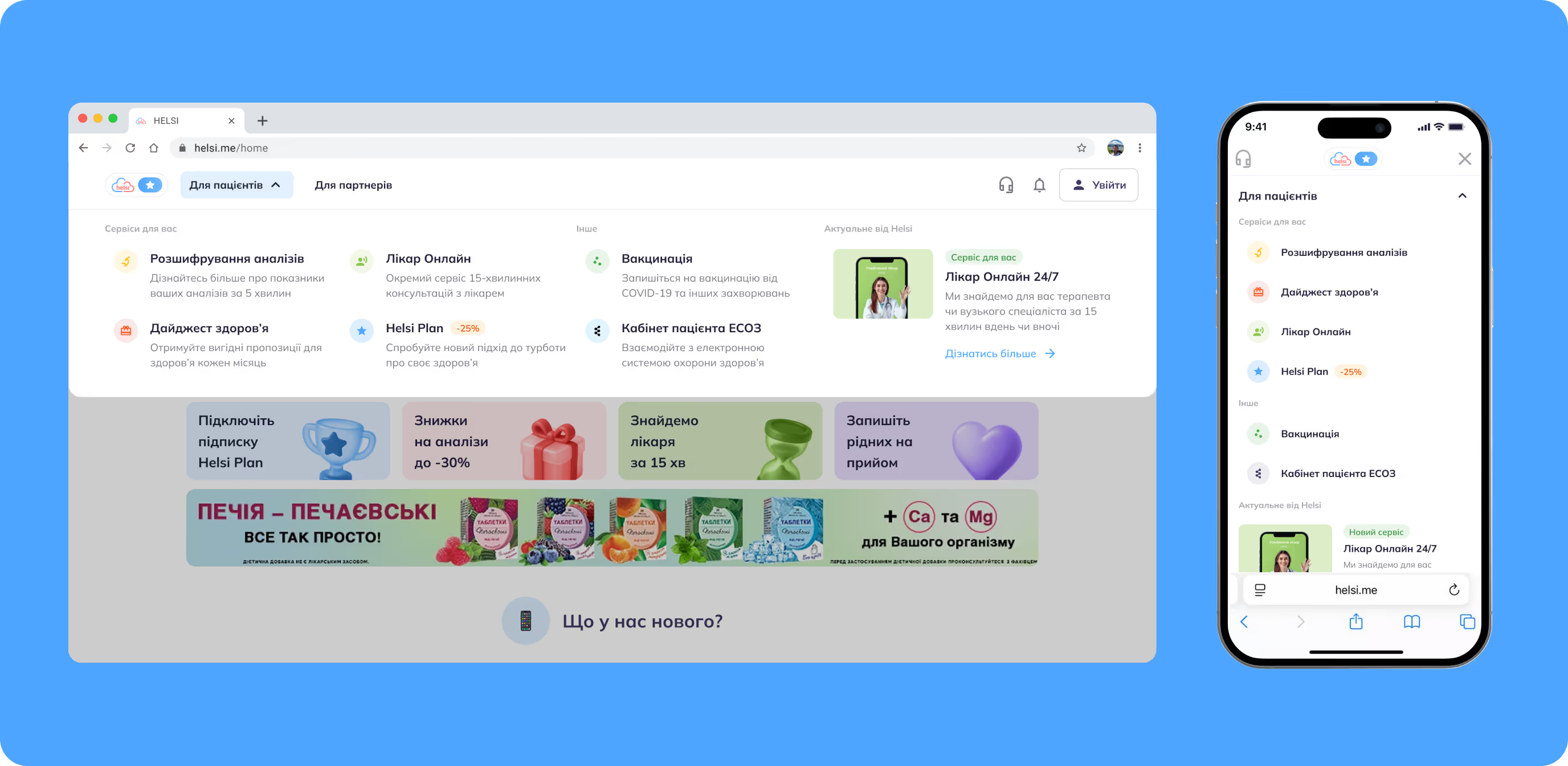
I reduced the number of tiles from 8 to 4 and moved popular search options to the top—they were previously buried on the third scroll, but now appear right next to the search where they make the most sense. I also streamlined the header navigation and improved the overall visual design.
Features & Promos
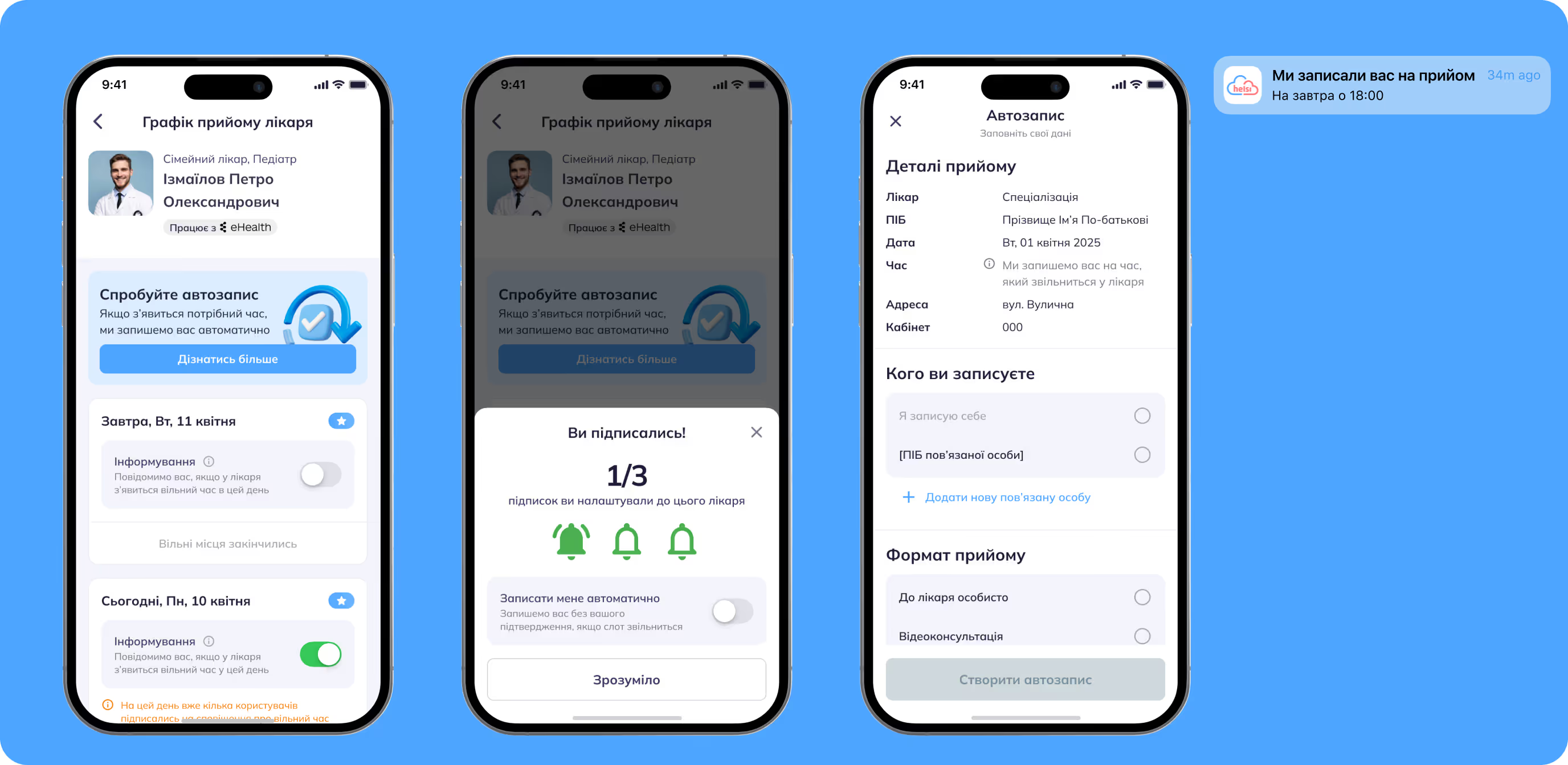
AUTOBOOKING
If we introduce a feature that automatically secures appointments, users may be able to book more reliably and engagement with the service could increase.
After my research, I recommended introducing autobooking to help users secure appointments more reliably. Some doctors have very limited time slots, and many patients compete for them. Although we already offer notifications when a slot opens, many users still miss their chance. That’s why I proposed a feature that automatically books the appointment as soon as a suitable slot becomes available. Since this feature is included only in the yearly subscription, it encourages users to choose the annual plan over the monthly one and increases our ARPU.

APPOINTMENT CONFIRMATION
If we remind users about their appointments and make it easier to manage them, no-shows may decrease and the overall experience could improve.
Many users book appointments but don’t show up, which leads doctors to take patients outside the system, increasing the queue. As a result, people end up waiting even after their scheduled time has passed. While we can’t control doctors’ behavior, we can ensure that users are reminded of their appointments or can easily notify if they can’t make it. Implementing this reduced no-shows by 28%.
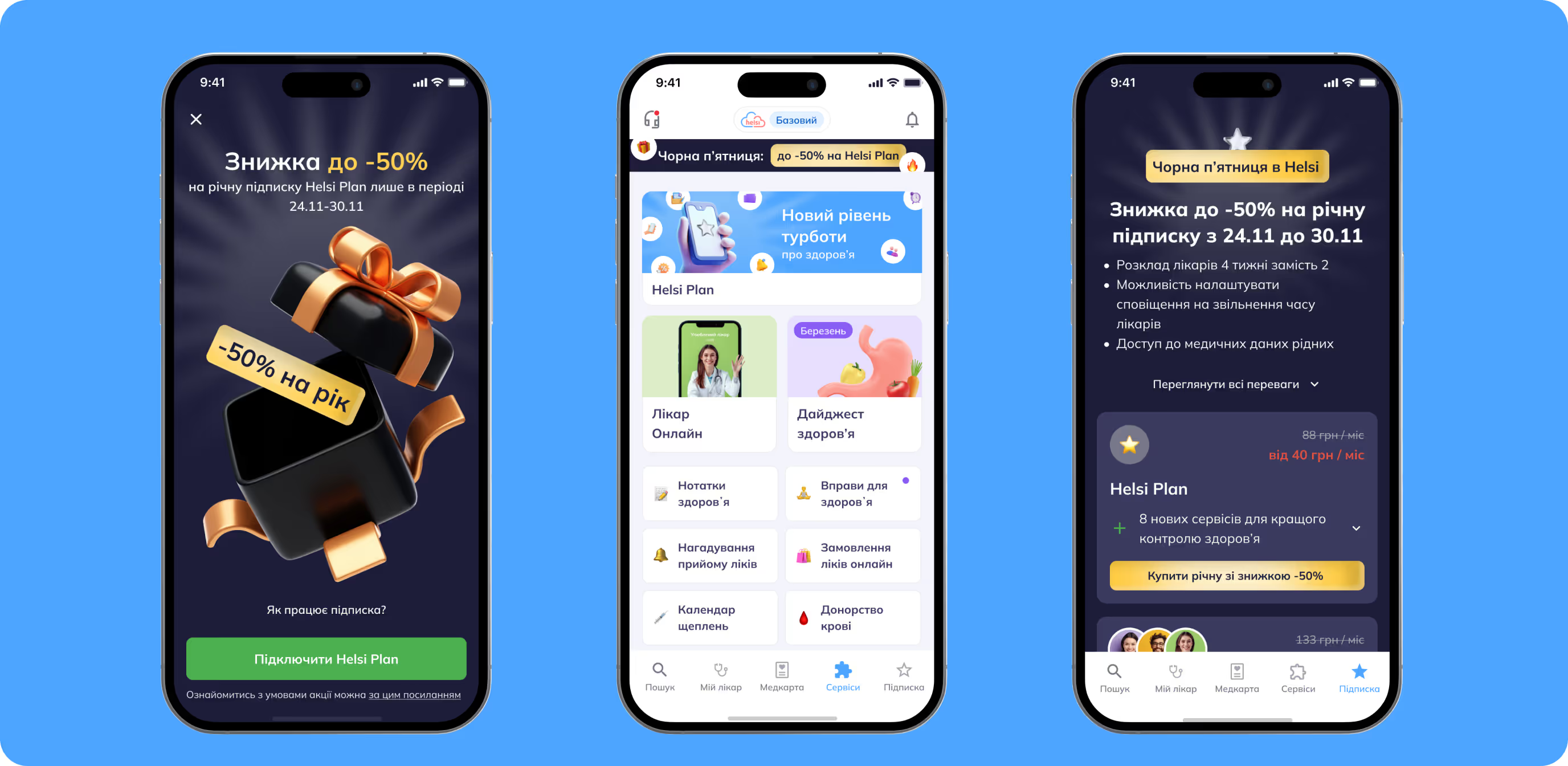
BLACK FRIDAY
If we run a Black Friday promotion, users may be more likely to purchase the yearly subscription, potentially increasing overall conversions.
This is a fairly common solution, yet somehow we had overlooked it. Over the measured period, it brought us 1,324 yearly subscriptions.


